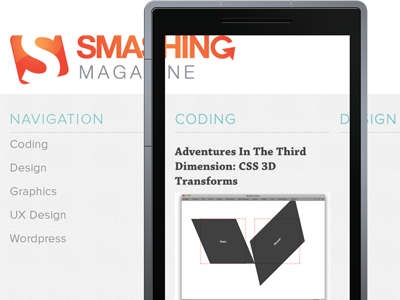
Smashing WP7 - Take Two
January 15 2012, 7:37pm
Take two. Tried to go along the current SM design a bit more. Still not completely liking it. But it looks decent. (The post title font isn't the same as on the site because I don't have that font but the one I used is close enough.)

